

"NEW AGE DARKNESS"
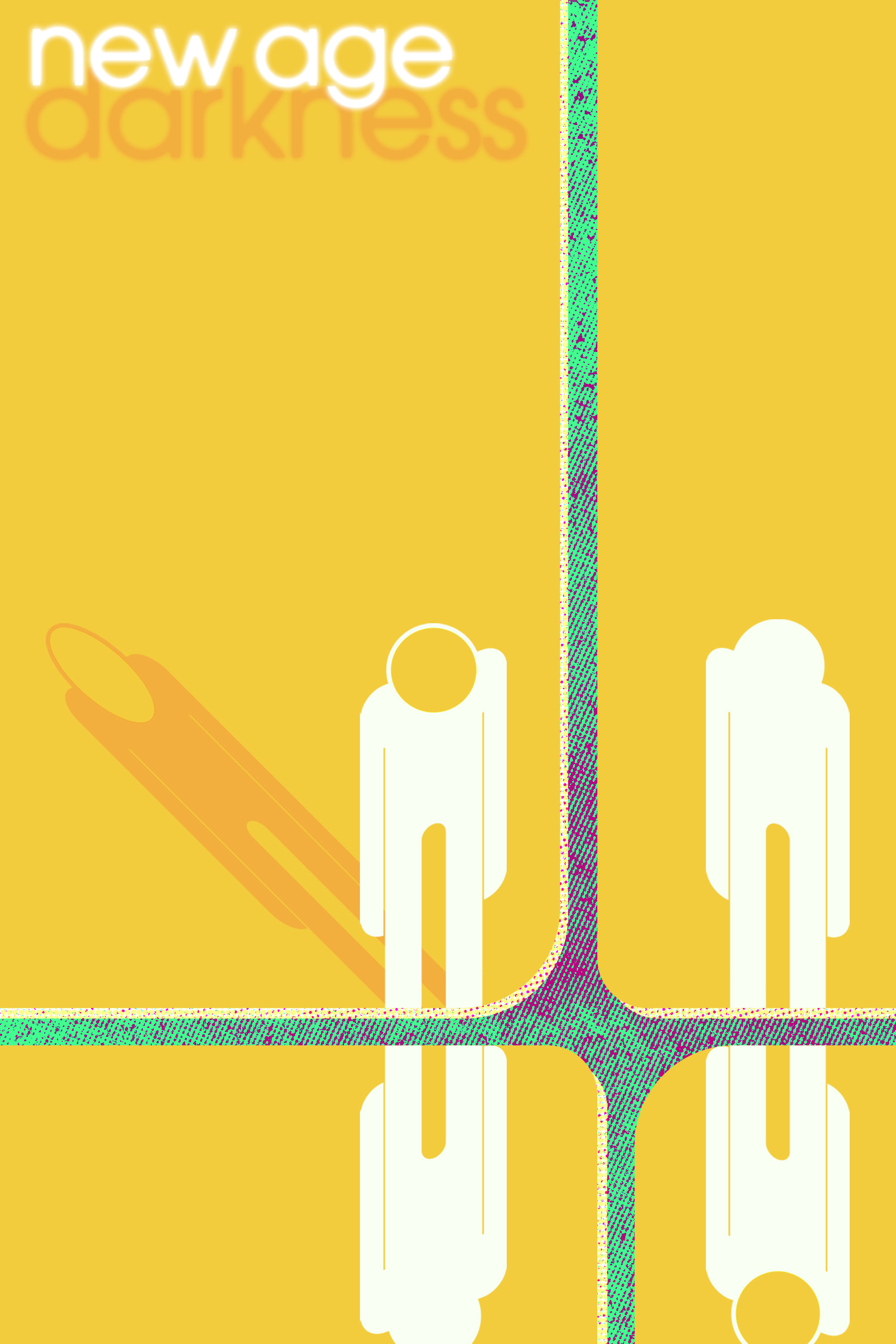
A design resembling a book cover. Bright, captivating colours hopefully make for an eyecatcher on any shelf in the library. Though, I'm pretty sure that style has been "in fashion" since the 2000's. It's better than any given Danielle Steel book cover at least, and that's a verifiable fact. Yes, I will judge a book by its cover, thank you very much.
This one was kind of fun, given there's actually source material for this cover... that I won't tell you about because it's private (and hasn't been released anywhere)! I can say this, at least: it's a story that features aliens, and war, and revolution, and characters who struggle to find their place in it between people struggling to also find their place. Across time and space, people must organize somehow while carrying their mental health issues over light years, and will constantly rub against (with great friction) other people who are attempting to define that non-matter of the self which lacks definition, taking form only by other peoples' mental image of it; the absence of defining characteristics is a defining characteristic in it of itself.
"Do you see the me that exists in you? Do you see through me? It's the only way I can see you."
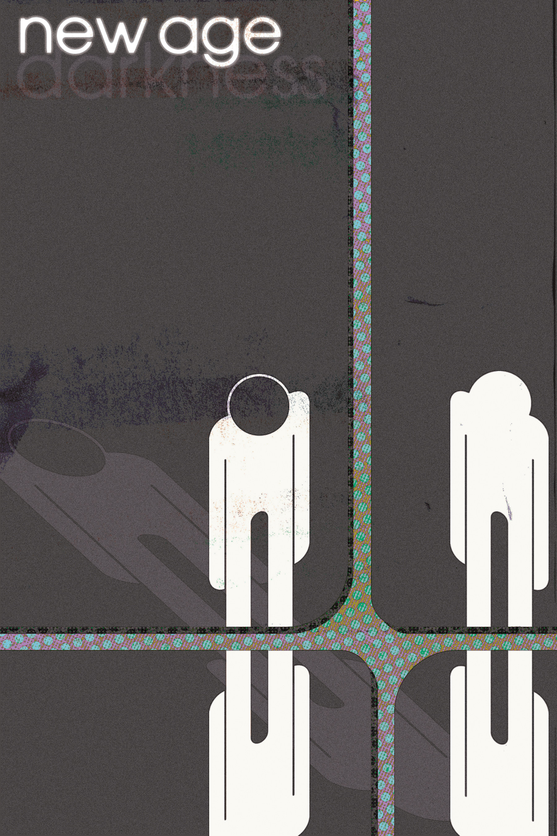
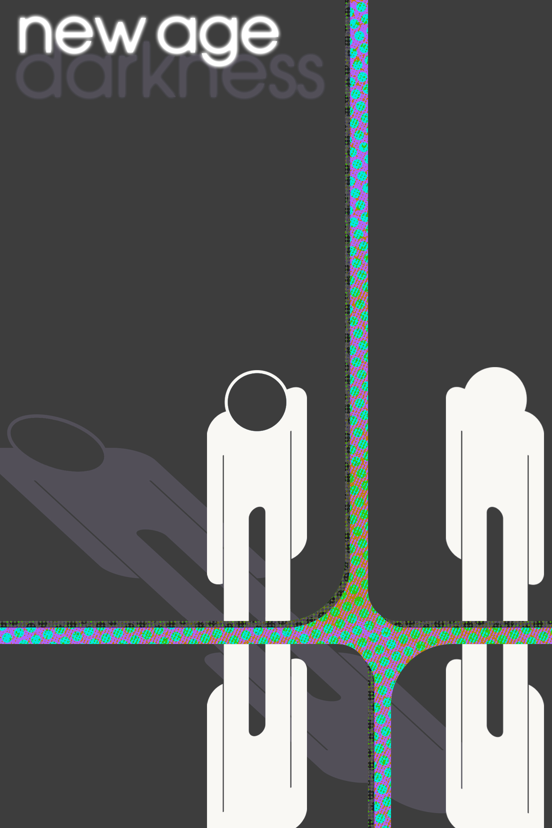
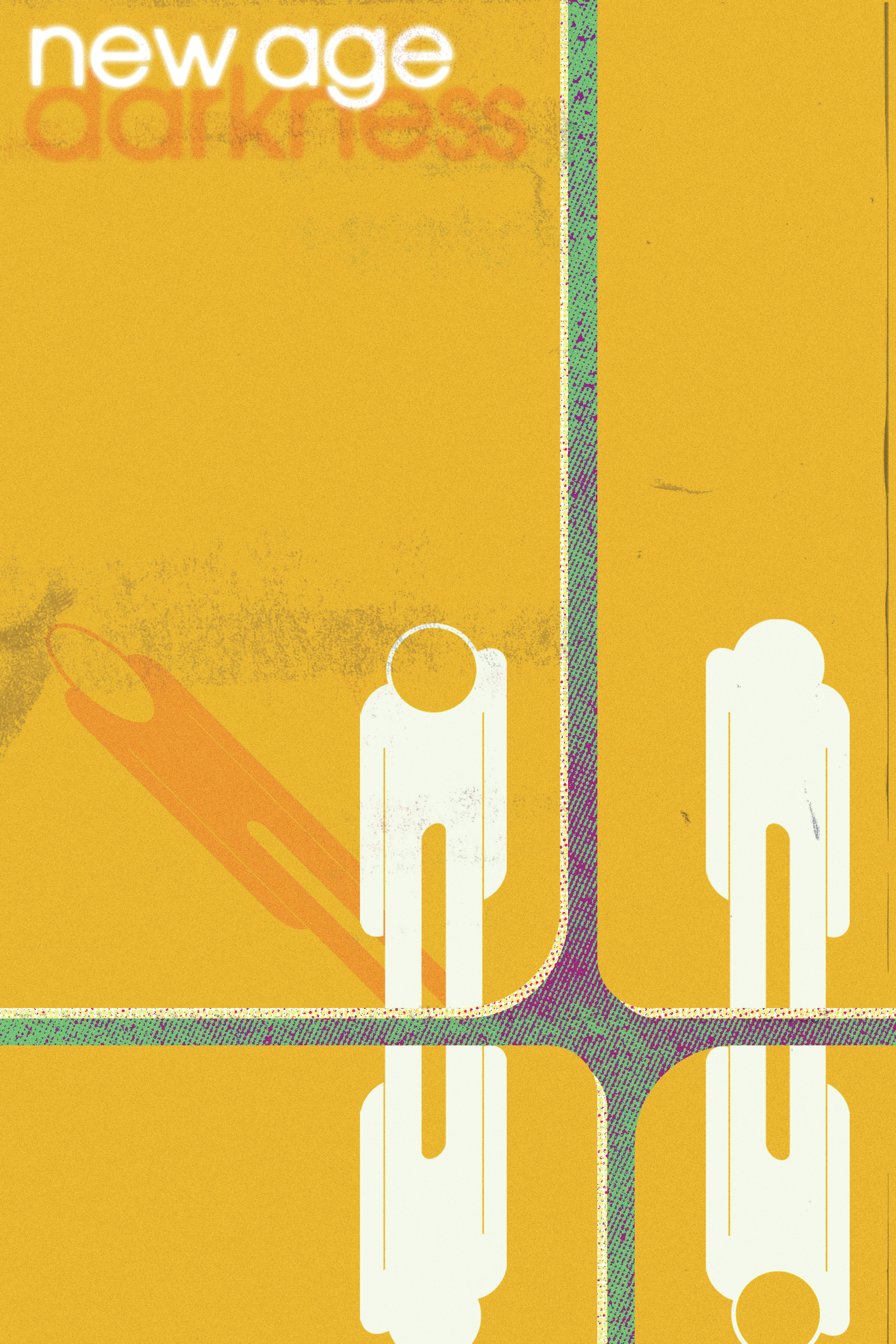
That a good enough definition for ya then? Hopefully it comes across in the sort of 60's "informational symbol" graphical style and negative space I used in this design. It's a start, but it's a personal favourite. This is also my first instance of trying out alternate colour versions (at request of the "client") and RBG/Damaged CMYK versions, where I print and re-scan my design with some flaws added. It's fun!
[2023]